Reco
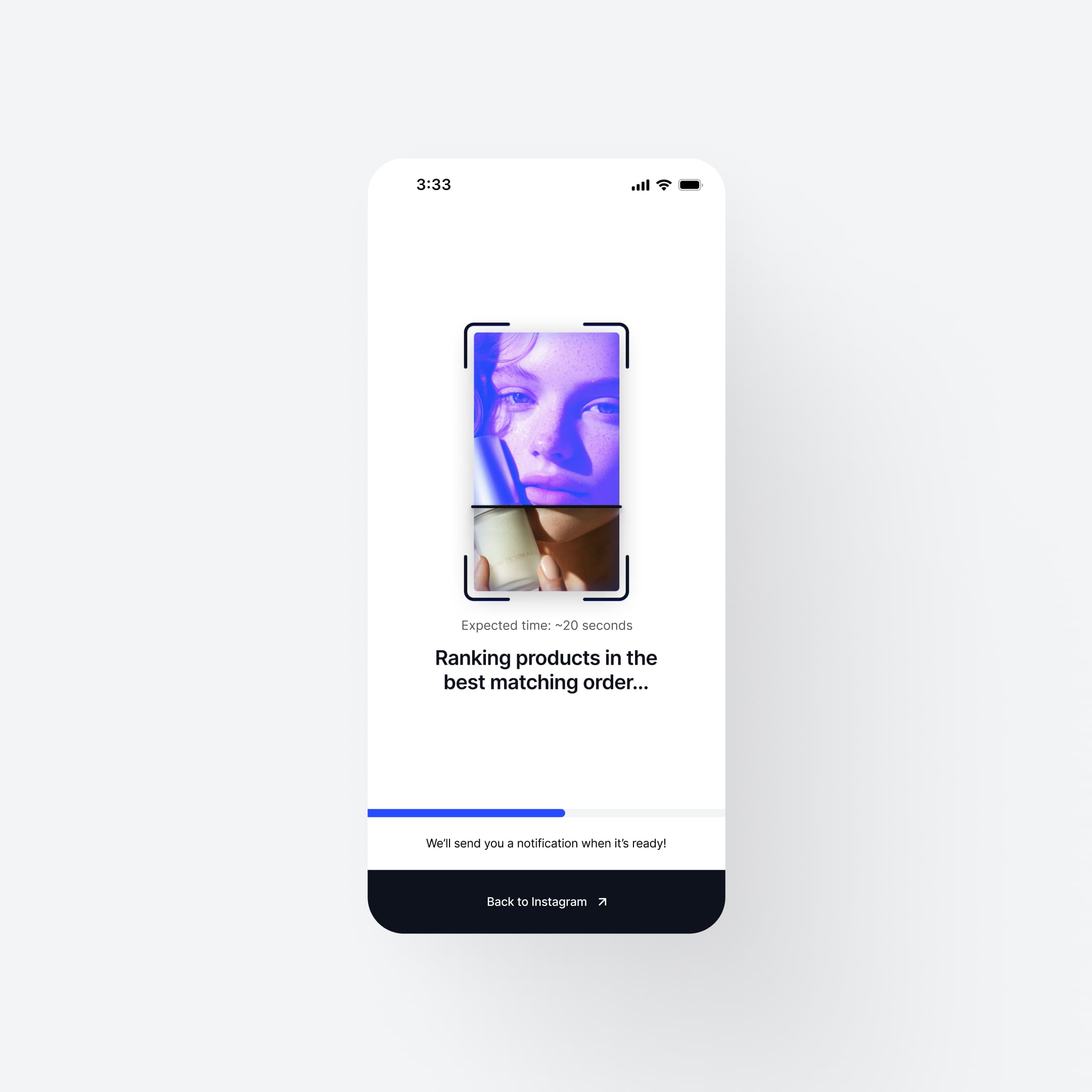
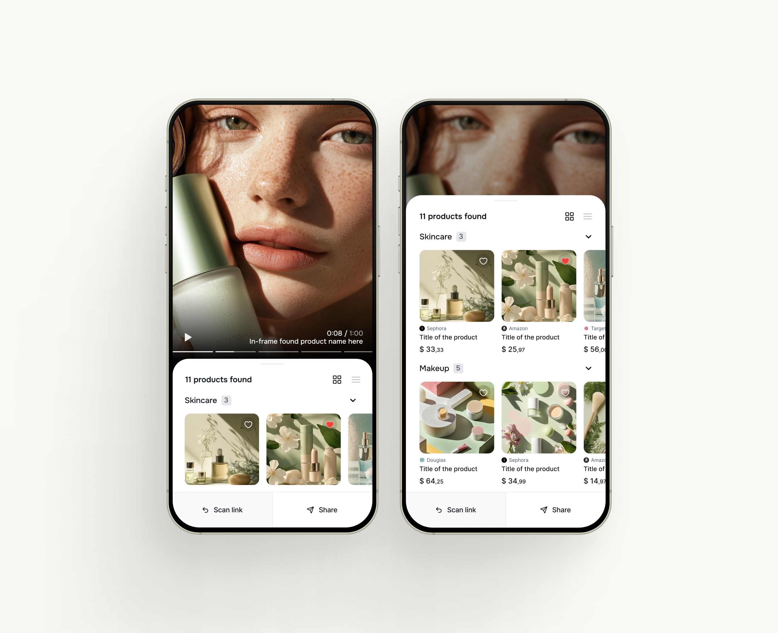
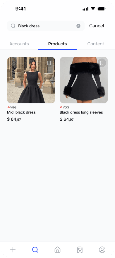
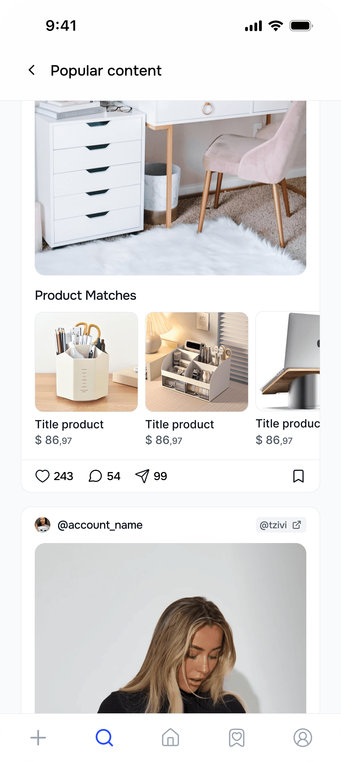
Reco began with a simple idea: find the products inside the posts you love. We worked with the team on the initial app launch, before funding or an established user base, shaping the experience of scanning social content, discovering products, and saving what catches your eye.
Since that initial launch, Reco has grown to over 1 million iOS downloads.
- Services
- UX & UI design · Visual identity
How we started
A few screens. Then the whole app.
We started with a couple of screens so the team could get a feel for how we work. They loved the result, and that small first project grew into designing the rest of the app together.

Early iterations
Move quickly. Explore the options.
We worked in quick iterations, bringing several alternatives to the team early on. For the main screens, we explored different layouts, interactions, and messaging side by side, making it easier to get feedback early and move forward with a clear direction.
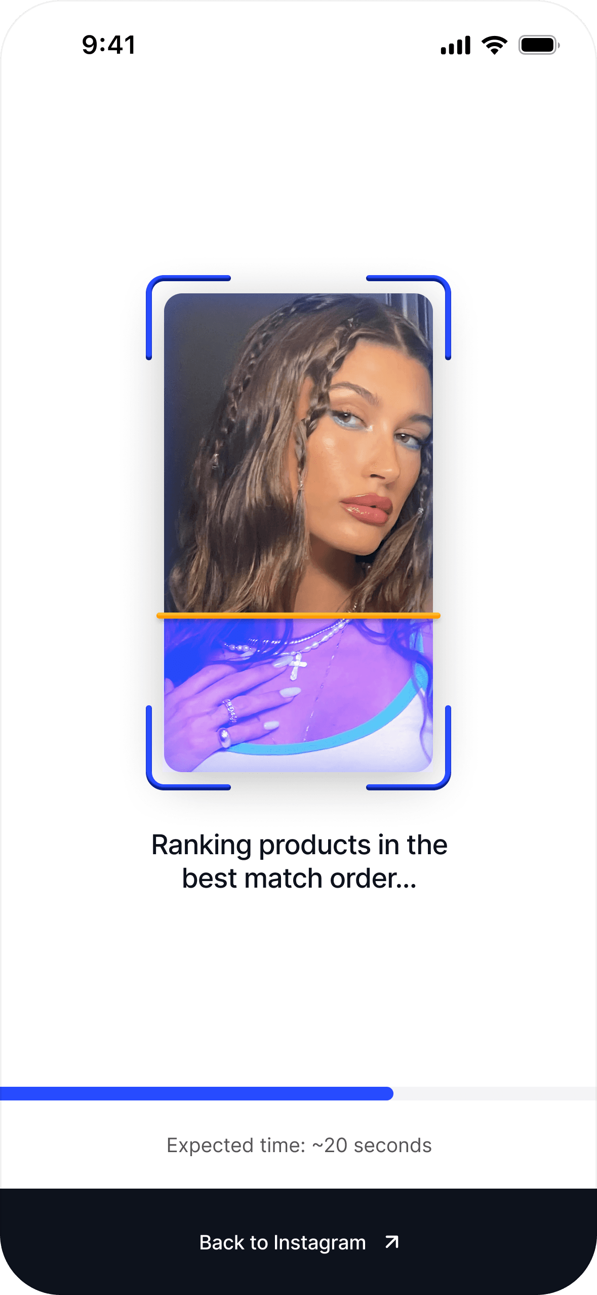
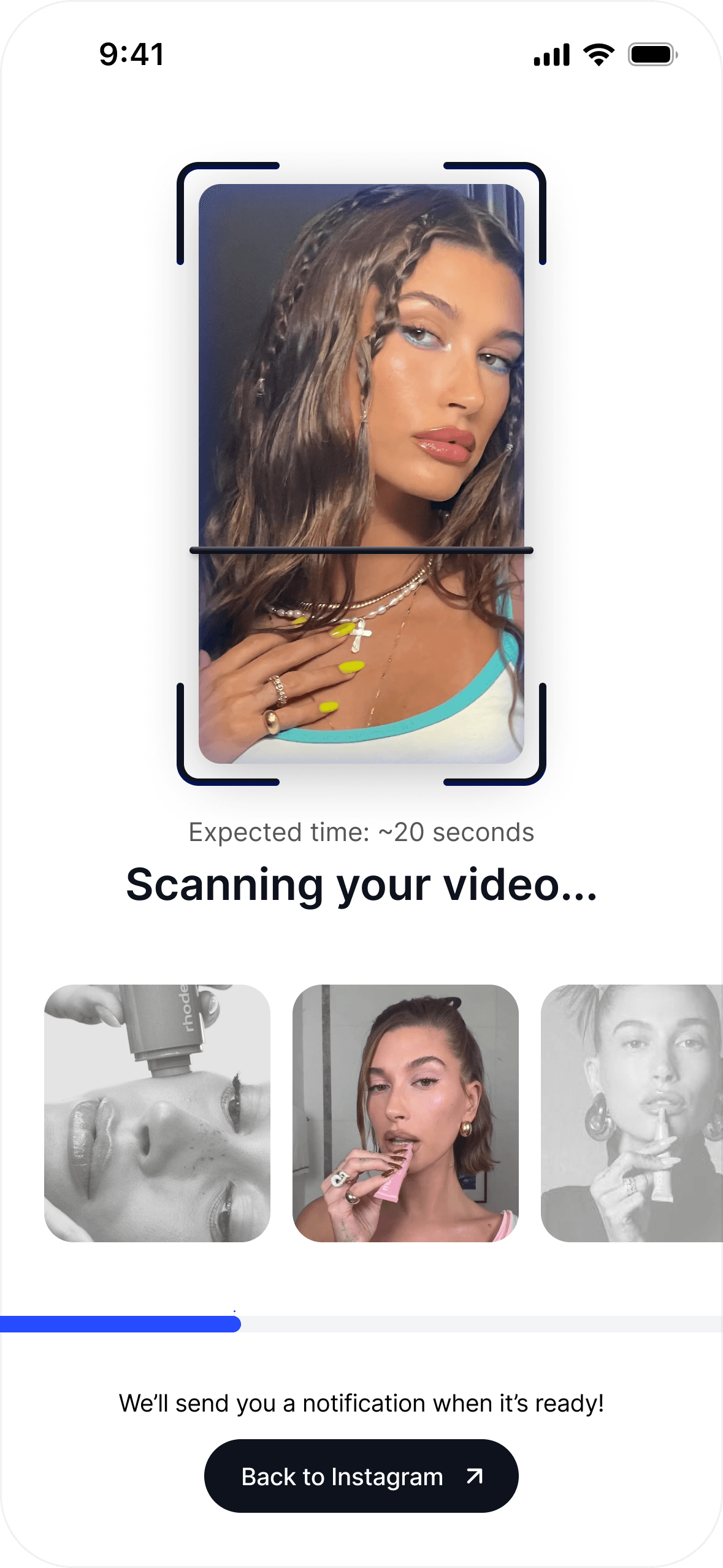
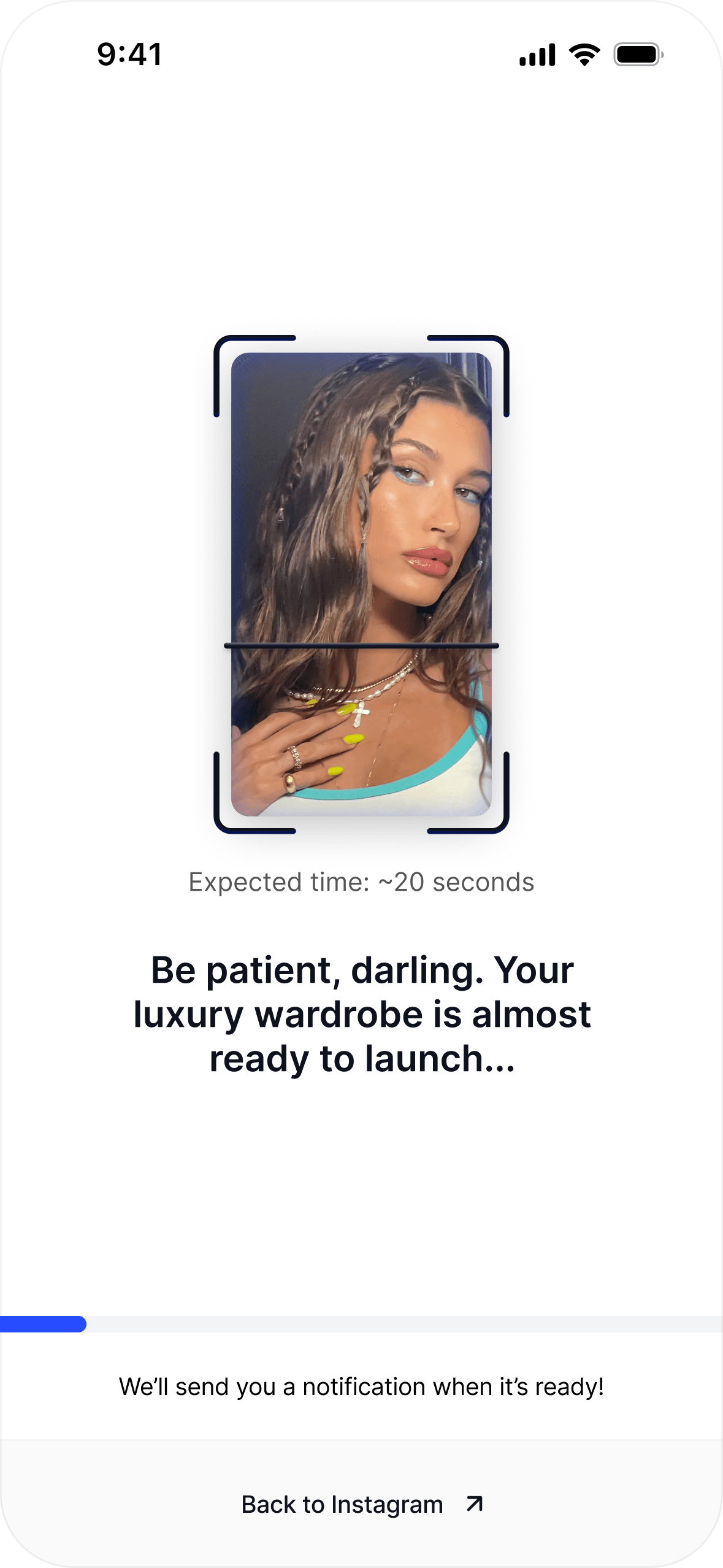
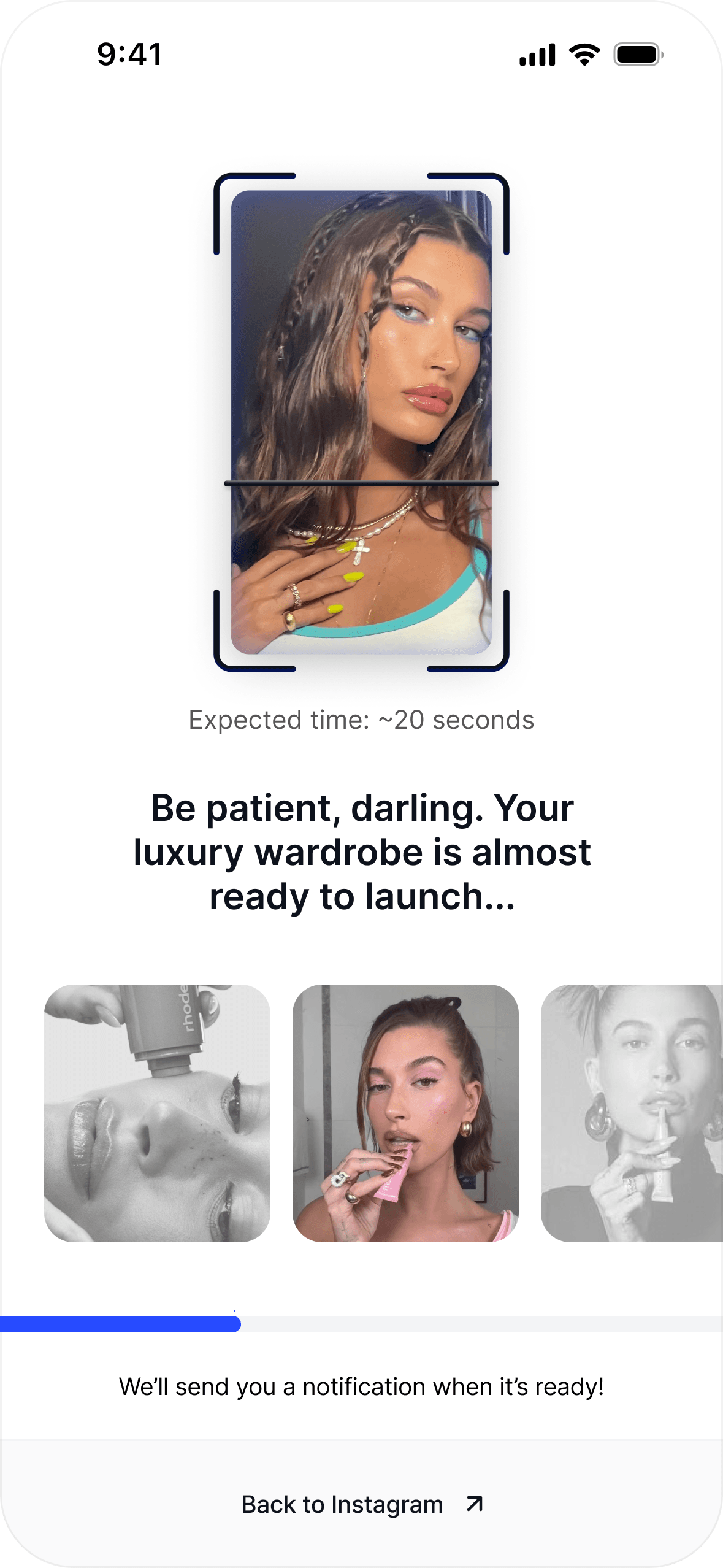
UX/UI strategy
From discovery to everyday use.
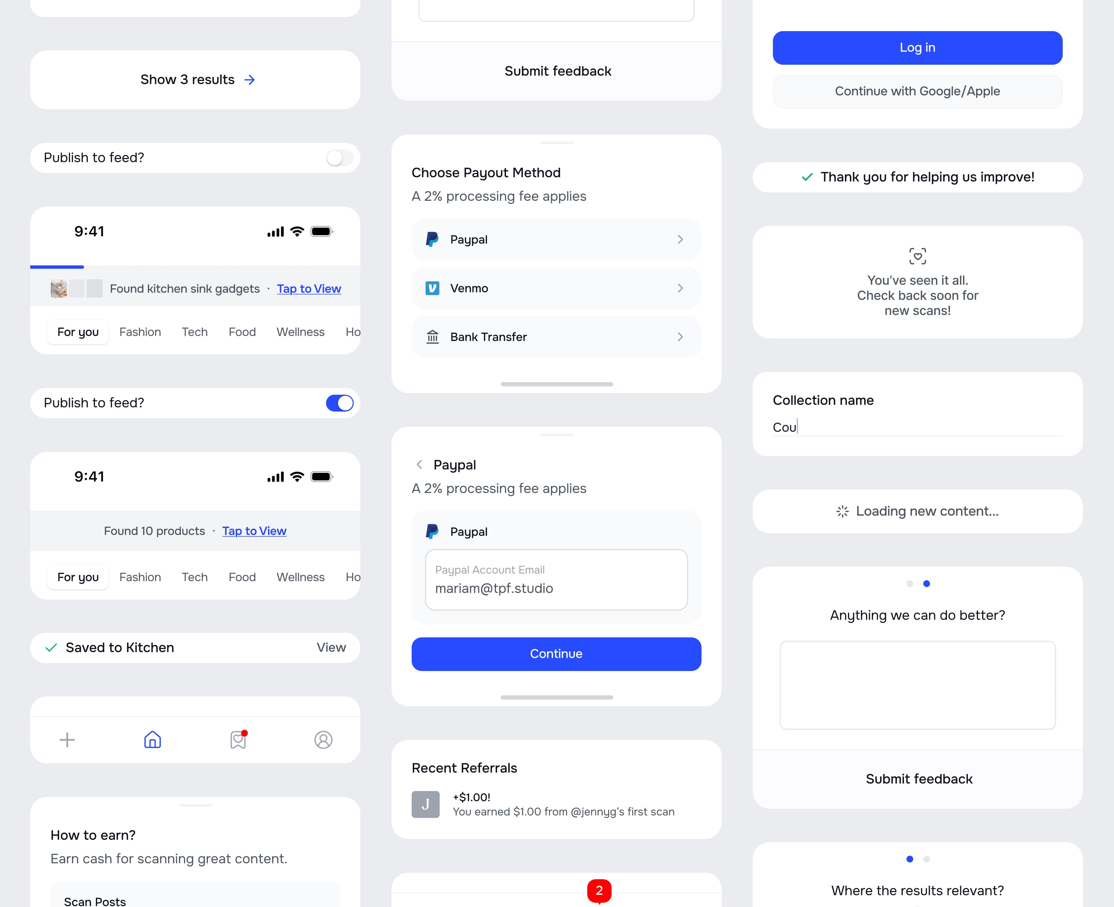
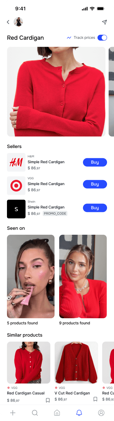
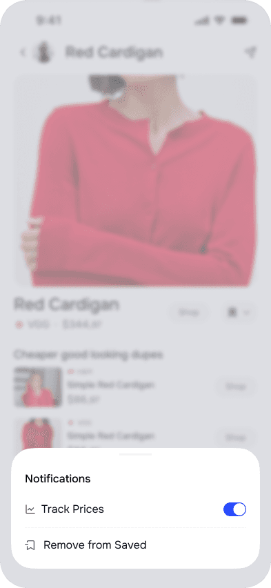
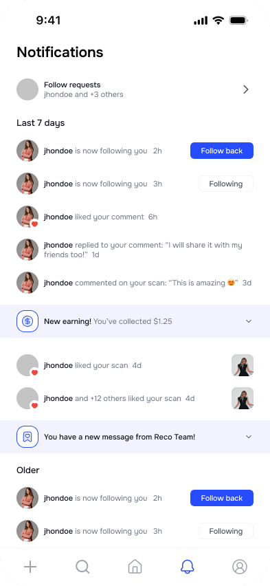
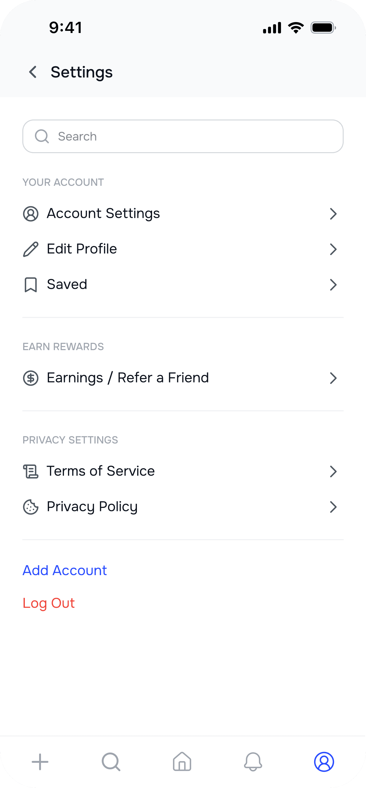
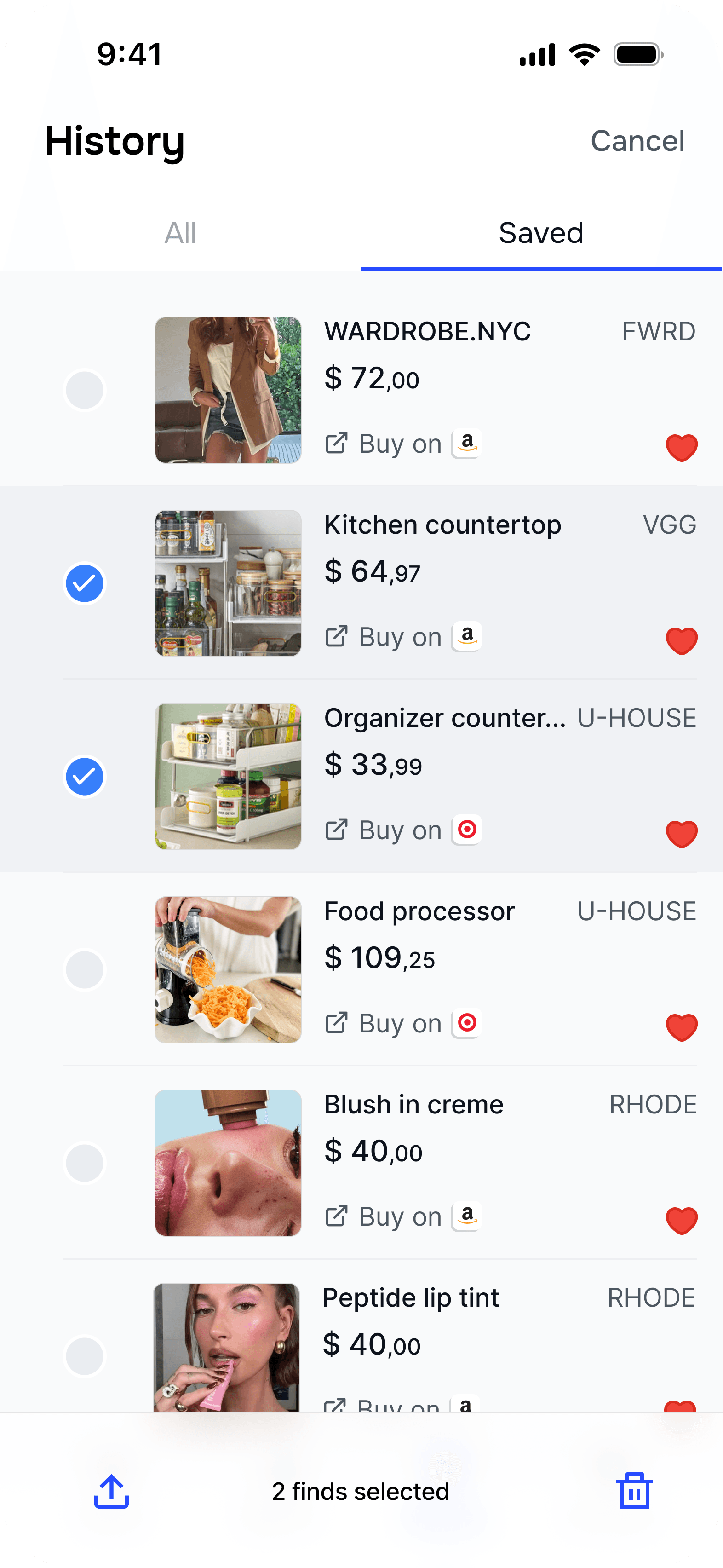
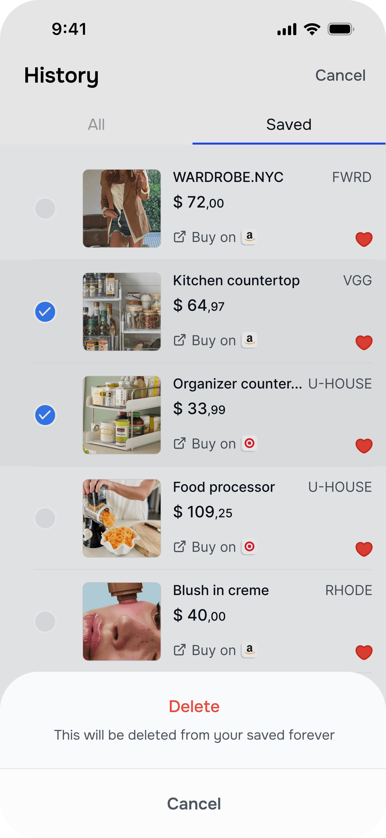
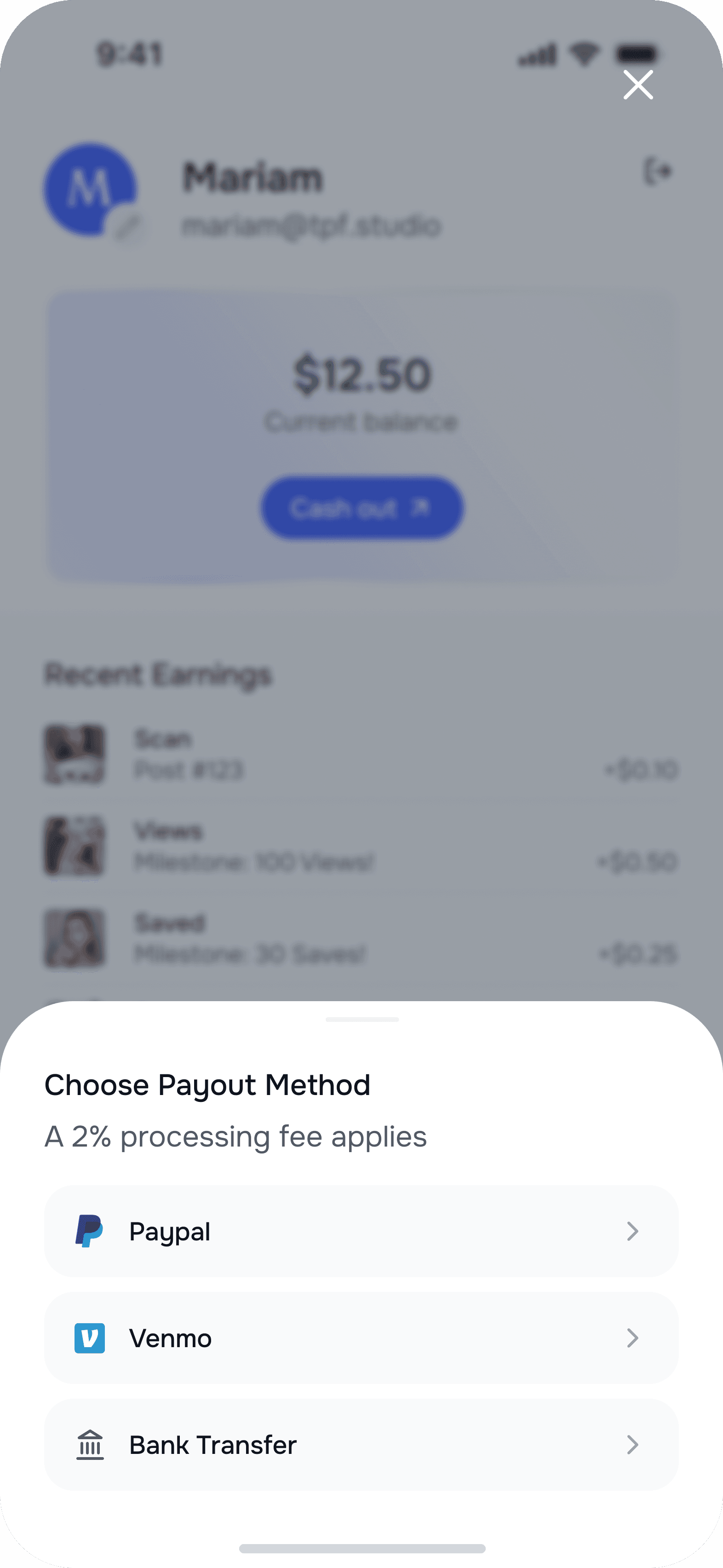
Finding a product is just the start. We designed what comes next: saving it for later, keeping an eye on its price, and sharing it with someone else. The interface builds on familiar social and shopping patterns, so people can explore Reco without learning a new set of habits.
.png&w=3840&q=75)
%20(Error).png&w=3840&q=75)
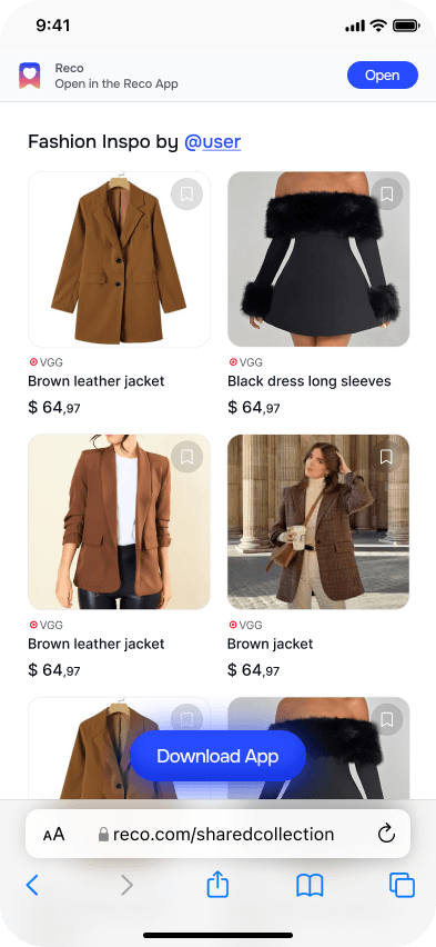
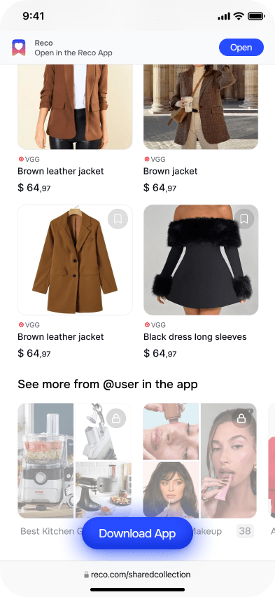
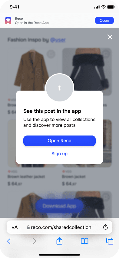
Landing page explorations
Extending the work beyond the app
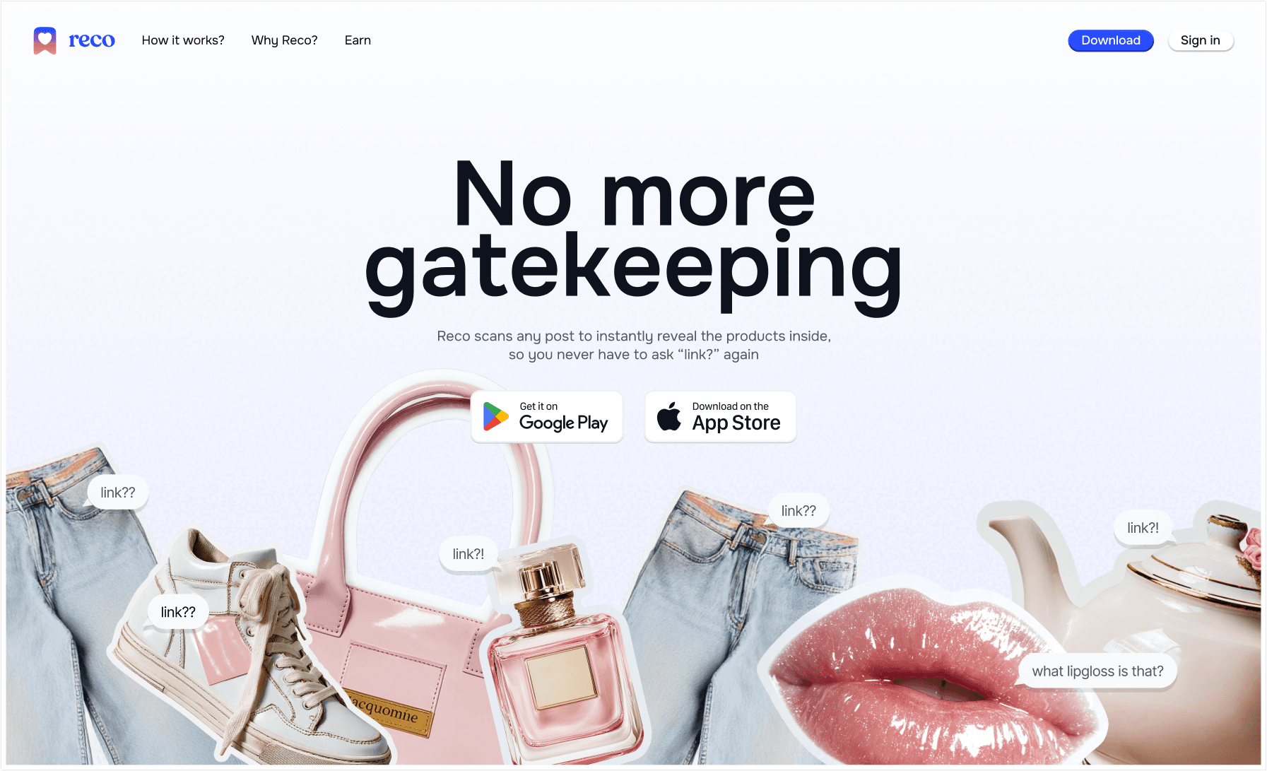
We explored ways to introduce Reco through a landing page, pairing familiar requests for links with the products people discover.